Mind - nhs Trusts
+240%
increase in data types collected for sharing
+75%
increase in willingness to share data
+40%
increase in engagement with clinicians
+50%
increase in trust between patients and parents
Designing a Safe Space for Youth Mental Health
In adolescent mental health, the relationships between the patient, their parents, and clinicians form a complex and interdependent network we refer to as the "Triangle of Care." Each point of the triangle represents a critical component in the support system, and the interactions between them significantly impact the effectiveness of care.
Design challenge: How can we facilitate improved communication within the Triangle of Care without compromising trust?
My role
I worked as a user researcher and UI designer on this project, leading both the research and design phases. I planned and conducted remote user interviews over Zoom, speaking with a wide range of user groups to uncover their goals, behaviours, and pain points. I prepared interview scripts, recruited participants, and facilitated in-depth conversations to ensure we captured meaningful insights.
Based on the findings, I created interactive prototypes and tested them with users to validate our ideas.
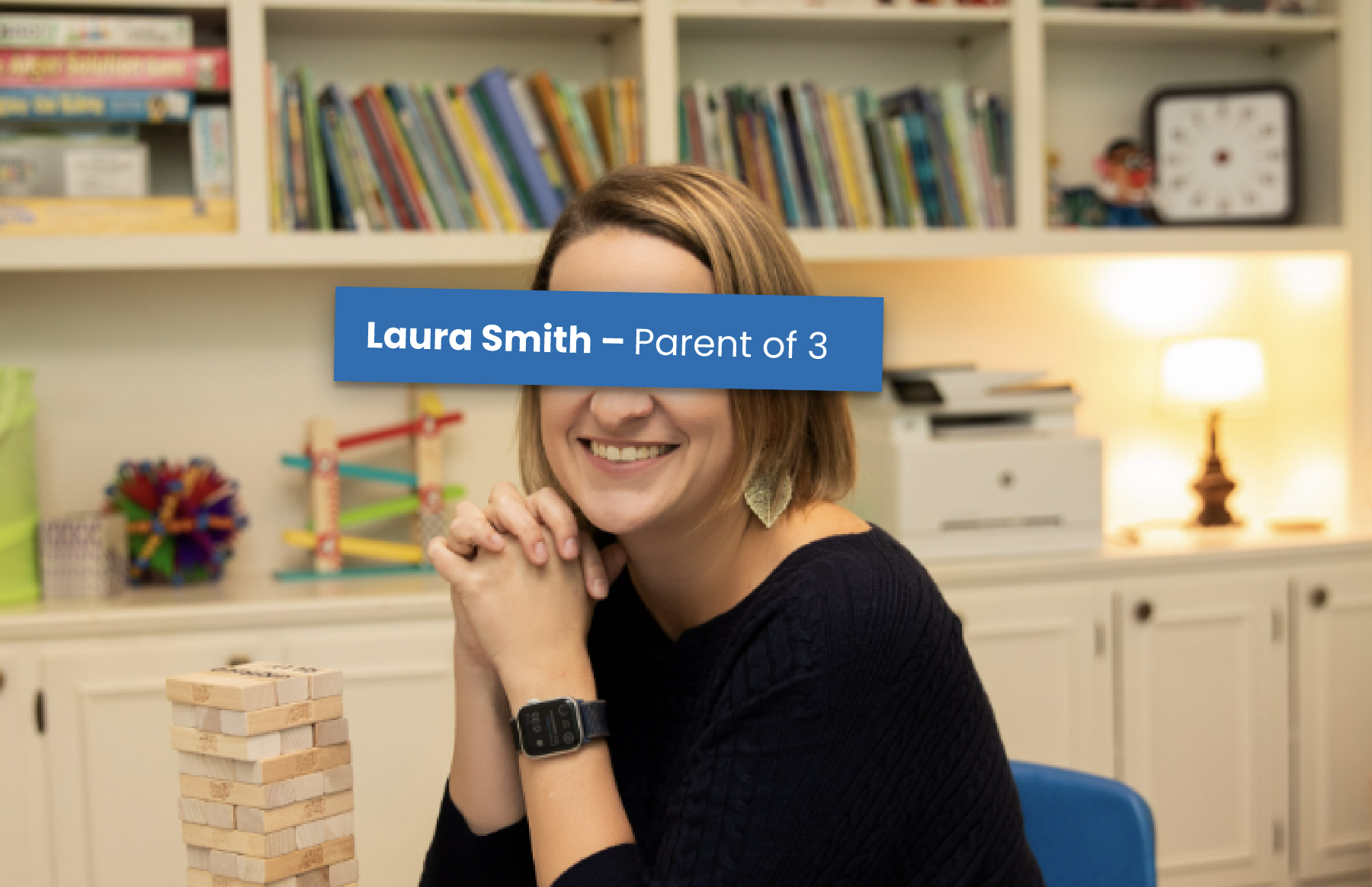
Users
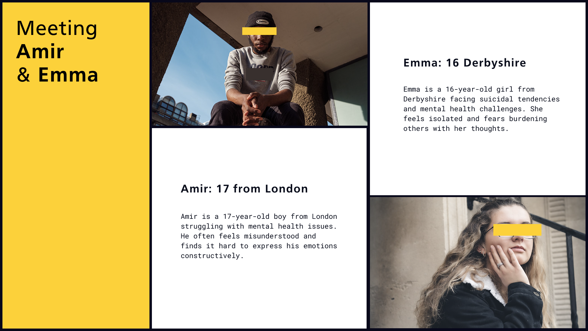
We selected 8 users to engage with through interviews and shadowing sessions. To gain a deep understanding of their needs, we connected with not only the users themselves but also their parents and carers. We conducted a range of interviews and asked users to walk us through their current care systems, explaining how they interact with them. This helped us identify key patterns and insights, which we used to develop detailed user personas.

Persona Insights:
Through our research, we identified two core user personas with distinct yet overlapping needs, both primarily centered around communication challenges. Each persona faced unique difficulties in expressing themselves, but a key commonality was their discomfort in communicating sensitive issues with both clinicians and parents.
The main difference between the two personas lay in where they felt more comfortable sharing their thoughts and emotions:One group of users felt more at ease opening up to clinicians in a structured, professional setting.The other group felt more comfortable sharing with parents or in a more familiar, informal environment.
A crucial insight that emerged was the importance of creating a safe space for users to express personal and mental health concerns. Facilitating open and trusted communication channels tailored to each user's comfort zone is key to addressing their underlying emotional and psychological needs.


Hypothesis and Approach:
We developed the hypothesis that while it’s natural for issues to arise and circumstances to change over time, the key to supporting users lies in enabling them to share at their own pace and on their own terms. We recognized that fostering a sense of control and comfort around communication would be essential in helping users open up and manage their emotional well-being more effectively.
Step 1: Building Comfort Through Private Reflection
Our first step was to create a space where users could privately record and reflect on their feelings without the pressure of immediate sharing. We designed this feature to allow users to express themselves in a low-stakes, personal setting—free from judgment or expectation. By providing a private outlet, users could gradually build confidence in recognizing and articulating their emotions.
Step 2: Developing Tools for Emotional Management
Once users felt comfortable recording their feelings, we introduced a set of tools to help them process and manage these emotions more effectively:Mood Tracker: A feature that allows users to log their emotional states over time, helping them identify patterns and triggers.Goal Setting: A structured feature that empowers users to set emotional or personal goals, encouraging proactive steps toward mental well-being.
Step 3: Empowering Users to Seek Help When Ready
By helping users recognize and manage their emotions independently, we aimed to give them greater clarity about their needs. This, in turn, would help them reach a point where they could confidently decide when and how to seek help. The goal was to shift from reactive, potentially overwhelming sharing to more intentional communication—enabling users to express their needs clearly and at the right time. This approach would prevent miscommunication and emotional fatigue, fostering a healthier and more effective support system.
By allowing users to engage with their emotions privately and equipping them with the right tools, we created a pathway for them to feel more in control of their emotional health. This not only reduced the risk of oversharing and misunderstanding but also helped users develop a stronger sense of self-awareness and emotional independence.


Usability Testing:
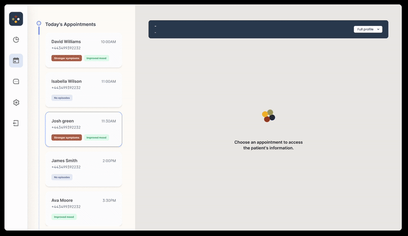
Since we didn’t have access to build the app right away, we decided to create a proof of concept to test our ideas and gather early feedback. Instead of sending out prototypes remotely, we opted to invite users to our office for in-person testing. This allowed us to not only observe their interaction with the app directly but also conduct real-time interviews to gather deeper insights into their experience and emotional responses.
Testing Setup and Process
We invited users to visit our office once a week over a six-week period.
During each session, users interacted with the app through our testing portal and UI, providing us with valuable feedback on both functionality and design.
Users were encouraged to record their thoughts and experiences using the app, allowing us to track their emotional responses and engagement levels over time.


Insights:
Iteration and Improvement
The in-person format allowed us to have immediate, open conversations with users after each session. This gave us actionable insights that we used to refine and improve multiple features after the first round of testing. For example, we enhanced the mood-tracking functionality, simplified the goal-setting process, and adjusted the overall user flow to make it more intuitive.
Outcome and Impact
Over the six-week testing period, we saw a noticeable improvement in how users engaged with the app and managed their emotions. Users became more comfortable expressing their feelings, and their confidence in recognizing and articulating their needs grew steadily.
Most significantly, there was a marked improvement in how they communicated with their parents and how those relationships evolved. Users reported feeling more understood and supported, which reinforced our belief that empowering them to share at their own pace was key to building healthier communication patterns.
This hands-on testing approach not only validated our core design principles but also highlighted how thoughtful, user-centered adjustments could drive meaningful behavioral and emotional improvements.


.png)