Villa plus
+300%
first interaction retention
+75%
increase in willingness to share data
+40%
increase in engagement with clinicians
+50%
increase in trust between patients and parents
The UK's leading villa accommodation specialist. Established since 1986.
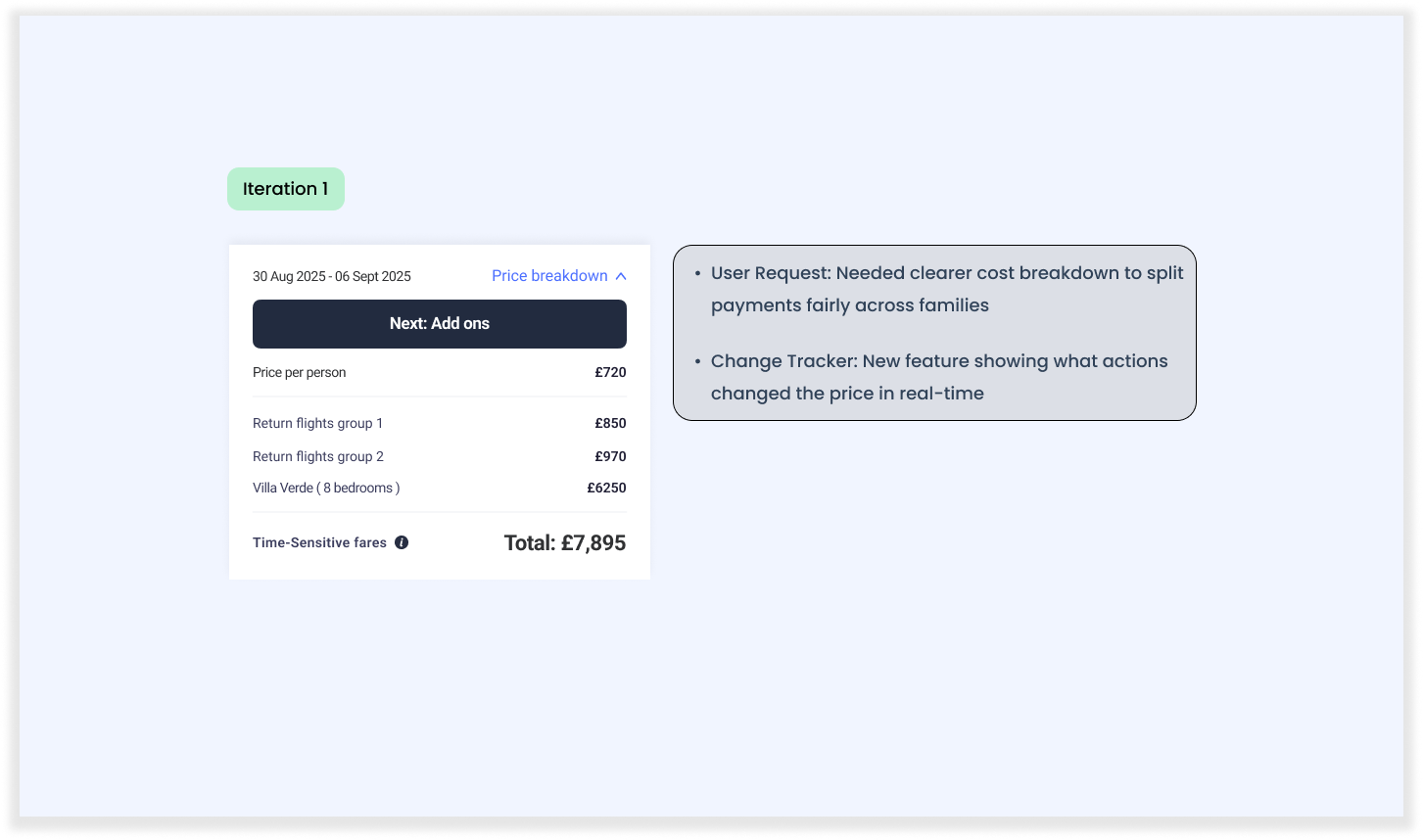
Villa Plus is the UK's largest luxury villa holiday provider, offering a comprehensive booking system that allows users to search, browse, book holidays, and arrange travel insurance.
Their package holidays include flights, villa insurance, car hire, and more.When I joined the company, there was no existing mobile app, so I was responsible for designing the entire mobile experience from scratch.
Additionally, I led a complete overhaul of the web experience. Working closely with product teams and cross-functional teams, I successfully delivered this full-scale transformation in under a year as the sole designer.
Case study is available upon request via video call only.
My role
I worked as a user researcher and UI designer on this project, leading both the research and design phases. I planned and conducted remote user interviews over Zoom, speaking with a wide range of user groups to uncover their goals, behaviours, and pain points. I prepared interview scripts, recruited participants, and facilitated in-depth conversations to ensure we captured meaningful insights.
Based on the findings, I created interactive prototypes and tested them with users to validate our ideas.I worked on enhancing the existing website and implementing a new web app with multiple new features, collaborating closely with the Marketing, CRM, and Support teams. I engaged with each team to understand their needs, gather requirements, and deliver the final product. As part of the Engineering team, my primary focus was simplifying features to ensure they were aligned with business goals while being efficient to develop.
Establishing a Design Foundation from Scratch
When I first joined Villa Plus, the biggest challenge was the complete absence of a design system, site map, journey map, or any type of design artifact. I had to build everything from scratch designing and assembling all the necessary components. With no existing design flows or framework in place, I started by creating journey maps to define user pathways and establish a structured design foundation.

Redesigning the Search Flow
The existing search flow was overly complex and redundant, collecting unnecessary information along the way. I completely redesigned the flow from scratch, focusing on reducing the number of clicks per task to improve efficiency. This was especially challenging because multiple stakeholders from different departments had conflicting needs regarding the data being collected.
I took an iterative approach, carefully removing unnecessary elements one at a time and testing each change to ensure we maintained accuracy and met stakeholder expectations.


Introducing a New Design System and Expanding Key Features
One of my major responsibilities was to establish a new card-based design system from the ground up. The existing design lacked consistency and scalability, which created friction for both users and the development team. To address this, I collaborated closely with the development team to design and implement a robust, modular card-based system that could adapt to different user scenarios and product needs. This approach not only improved visual and functional consistency across the platform but also made future development faster and more efficient.
Introducing New Features to Improve User Experience
In addition to the design overhaul, I introduced several new features aimed at enhancing usability and improving user engagement.
Two key features were:
Similar Date Functionality: This feature helped users find relevant content or options based on similar dates, improving the discovery process and reducing user frustration.
Related Section within Flex Functionality: This allowed users to see related options and alternatives within the same feature, increasing user engagement and helping them make more informed decisions.

Design System Development
Building the design system involved defining a consistent set of:
UI components: such as buttons, input fields, and cards, designed for reusability and scalability.
Typography, color schemes, and spacing guidelines to create a cohesive visual language.
Interaction patterns to ensure a seamless and predictable user experience.
To make the handoff to developers smooth, I documented the entire design system and collaborated with engineers to integrate it into the development pipeline. This ensured that all future feature updates and product iterations would follow the same design standards, reducing inconsistencies and development time.
Outcome and Impact
The introduction of the design system and new features led to measurable improvements:
✅ Faster development cycles due to reusable components.
✅ Higher user engagement with the platform.
✅ Increased successful checkouts due to a simplified and clearer user journey.
✅ Greater stakeholder satisfaction with a more predictable and consistent design process.
By building a scalable design foundation and introducing targeted features based on user behavior, I not only improved the overall user experience but also laid the groundwork for future growth and innovation.
